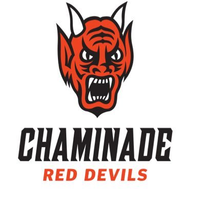
With the unveiling of some potential designs for the new school logo, two of our Cardinal and White writers decided to give their thoughts on the subject. Should Chaminade keep the current Red Devil or make the change to a new one?
Caden Fernandez – KEEP
In my eyes, Chaminade’s Red Devil logo is one of the best in high school sports. It is entirely unique to our school, and it has a very detailed and classic design.
I am not a fan of the new designs, mainly because they are so different from our current Red Devil logo. Minimalism seems to be everywhere these days, and the new concepts seem too generic and simple to me. The detail of the original Red Devil is one of the things I love so much about it.
I do not think I am in the minority (at Chaminade and in general) when it comes to preferring a classic logo. A current example is AFC Ajax, one of the largest soccer teams in the Netherlands. The team has recently announced that they will be returning to their traditional logo and dropping the more modernized, simpler version. This change was sparked by their fans, who preferred the classic style.

One of the biggest arguments for changing the logo is the lack of uniform branding across the sports teams. Firstly, I like the fact that each sport has its own unique identity and logo. Instead of having the same logo put on every piece of gear, there is a greater variety of apparel that students can wear to support each sport. On the other hand, I do understand the reason for wanting to create common branding. However, I see no reason why we need a new logo to do this. We have a great design already, and I would love to see a revival of the iconic Red Devil and see it used more throughout the school.
I am a big believer in the philosophy of “if it ain’t broke, don’t fix it.” The Red Devil has worked for years because it is an awesome, timeless logo. Students in the past have loved it, and the logo should be around for new students to enjoy as well. That being said, if changing the logo is inevitable, I would like the new logo to simply be an update of the current Red Devil (like the one pictured) rather than a complete overhaul like the concepts.

Owen Rutherford – CHANGE
The Red Devil logo is iconic and generations of students have loved this logo.
But, I believe that it may be time to move on from the old logo. As cool as the logo may be, it is very hard to stitch onto jerseys and uniforms. The Red Devil logo is rarely seen on a sports uniform in our school besides the hockey team, and a little logo on the back of the baseball hats. Although the old logo is classic, and I don’t think that we should necessarily get rid of it entirely, it is time to add a new logo that can be used for new jerseys to come.
I think that the old logo could maybe be a secondary logo. Again, I don’t believe that we need to get rid of it. After all, it is a great logo. But in terms of logistics, keeping the old logo (and not adding a new logo) does not make sense. I’m also a firm believer that change can be good. That is why the choice of the logo is important. It could potentially be the logo we use for another 50 years.
I agree with Caden that logos are getting too minimal nowadays. That is why my proposition is to keep the old logo, but add a new logo. I think blending old and new logos could benefit the school greatly. That is so if a team wanted to use the old logo they could, but if a team wanted to use the new logo because it is more affordable, they could do that as well. Personally, I believe that this is the best way of doing things. It is a way for everyone to be happy.


